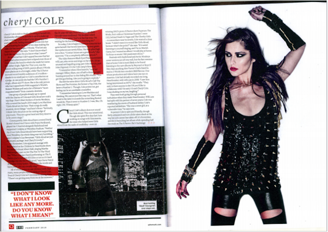
Q Music Magazine^^^^

Spin Music Magazine^^^^

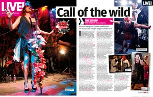
NME Music Magazine^^^^
Codes & Conventions:
-Dominant Large image used-> Usually takes up at least a whole page. Often uses direct address with the artist looking directly at the camera/its audience thus capturing there attention to read the article. If direct address isnt used then these large images are often action shot or live performance shots giving the audience a representation of there personality, style and the type of artist they are. If no other images are used then this one image is usually eye catching, mesmirising and boldly noticable (Usually displayed on the left however many go against conventions and put them on the rights, others bleed over the whole double page spread) Relates to the article.
-Smaller images- Often placed around the text/article on the other side of the double page spread. They usually emphasis and complement the point of the article. Often live shots or snipits of the artists music videos, usually more action taking place in the smaller images. Eg; the large image will use direct focus and be taken in a studio whilst the smaller photos are often taken out and about at events, festivals, locations ect.(often posisioned on angles to make them more intresting, personal and to reflect an artists personality)
-Quotes-> Directly from the artist or the person the article is about. They add belivability to an article as the artist has said these exact words, gives the article a personal touch making the audience feel like their reading exclusive information from the artist themselves. (as if there talking directly to the audience). Quotes are often used as headlines in order to define a belivable overview of the article, capturing the audiences attention to want to find out more. Quotes are always displayed in speech marks. They are sometimes used by pictures to summerise the point of them and break up an article into readable sections (often inlarger font or different colour in the middle of an article.). Quotes are usually shocking, misleading or controversial to capture an audiences attention to read the full article.
-Artist/Celebrities name-> This is usually made clear within an article either as part of a heading, subheading or description. This is made bolder to establish the point of an article and to establish them as important.
-Stand First-> Is used as a description of the artist/celebrity that introduces them in order to make in clear and establish to an audience exactly who this person is so there able understand the importance and point of them and the article itself. Not all the audience will know who the artist is especially with new up and coming artists.
-By-lines-> These are often put under images to give credit to the photographer and writer.
-Headline->Usually short, straight to the point, audience immediatly know what the article is about. It usually sums up what the article is about. Predominatly uses shocking quotes and unanswered questions the shock the audience and capture there attention to make them want to read on to find out more. Other articles are dedicated to the artist/celebrity and therefore use there names as the headline to attract their fans
-Qwerky sections-> these go against normal codes and conventions but are elements that make an article atand out for being different or is used as a motif for familiarity of a particular brand eg; Extra Large page number- unusual, extra large start letter of artists name placed behind text- unique to Q magazine, image edited to look like an arist is in the main text/headline or is part of it- displays an artist personality uniquely, captures audience attention.
-Informal Writing-> Articles are usually wriiten in this way to relax the reader, as a form of direct address and to make them sound more personal, up-to-date and intresting.
-Colour Scheme- Usually complements the style of the issue and the magazines genre, predominantly using the same colour scheme that runs through the whole magazine.The colour scheme is uaually simple and doesnt overpower the sricle, the colours used often complement the meaning behind the article and very often reflect the style, personality and genre of the artist. More often than not, the name of the artist is complemented by the colour scheme.
-The Text/ Article Writing Itself-> Conventionally uses an 11pt font size with an Arial font as its easy to read and relate too. However lots of magazines use fonts that complement and connotate their particular genre. The articles use a drop cap which clearly notifies the audience as to where to start reading. Articles conventionally uses colums, normally around 2-4, which make it easier to read and apear neat and tidy on the page rather than all over the page. The article is usually displayed on the right hand side or just the opposite page to the main large image.The page number, magazine name and text usually use the same font throughout the magazine.
-Page Number and brand name- Conventionally the page number is displayed in a small font at the bottom corner of each page (the side nearest the edge that people turn the page with) with the brand name usually at the bottom right hand corner of every right page. This means the audience can easily find the page and are constantly reminded of the brand that brought them the articles(more likly to remember them and buy the magazine again) becasue they are always litrally at the audiences/readers fingure tips.
-Spash's and Image description-> Images used in articles usually have descriptions placed at the bottom of the picture(conventionally right hand corner) which help the audience understand the meaning behind the image. These descriptions are often placed in a splash format or contrasting colours to the pictures in order to make them noticable, stand out and clear to read. Splashes are often used at the sides and top corners of pages to highlight important information, competitions, facts and teaser eg; 'live' or 'Exclusive. There used to highlight information that is in the audiences intrest or to hightlight things the writer wants the audience to notice in order to entise them into reading the magazine.
No comments:
Post a Comment