^^^^Original /Draft of DPS.
I started by choosing to
write my article as a catchy interview and then experimented with how
to lay it out on my double page spread and display it
using conventional techniques. To create this first Draft I first
took the ideas from my research and draft designs. I then looked at other
similar genre music magazine double page spreads that I liked from magazines
like NME and Q as well as looking through my DPS Research/designs to create a
conventional looking Double page spread that's effective, attractive
and targeted to suit my 15-25 aged target audience. I chose to use the red
colour throughout the page as it’s the most eye-catching colour to the eye,
stands out from the page, is conventional of other music magazines and fits with
the house styles continued from the other pages of my music magazines. I felt
the red colour also contrasts well with the black and white background, making
it look attractive and eye-catching. I cut out the image from
its background, as it was unattractive and not
conventional, by using Photoshop eraser and auto select tools. I experimented
with using a black and white effect on the image as I felt it gave it a modern,
edgy and attractive feel the suited the magazine and its target audience as
well as contrasting well with the bright red colour making it attractive.
I tried to include conventions of music magazines such as stand
first, large image, page numbers, issue date, brand logo/name, large
masthead, columns, pull quotes, teasers, drop caps, name of
writer and photographer and a catchy article with defined questions and
answers. I tried to write a believable article/interview that’s realistic to
what an Artist may say, including natural reactions like fillers
'errr' and (laughs). I formatted my article in conventional columns and clearly
defined the questions and answers with colours to make it easy/clear for an
audience to understand and read as well as being conventional. I then chose
quotes I thought where significant, eye-catching and typically relevant to
music magazines to use as pull quotes and as my masthead to make people want to
read it as there quotes direct from the artists mouth that withhold
information, making an audience want to read on to find out/understand more
about it/them. I tried to make my stand
first attractive with descriptive words and puns, holding back
information, along with the masthead, in order to persuade an audience to read
it to find out more. I made the font size 11 and font style Arial as they are
conventional of music magazines, easy for majority of a young
audience to read from and I also felt they made it look the most attractive
against the other house style of the page. Despite this I feel there are
many negative points about this draft that could be improved such as the
overall finish and style of the double page spread, using all the house colours
(yellow, red, black, white), completely erasing the background of the image to
make it professional, using a more dominant, conventional and eye catching
image and masthead, adding some more conventional points and improving the
overall quality and design to make it look as professional, attractive and
conventional as possible. 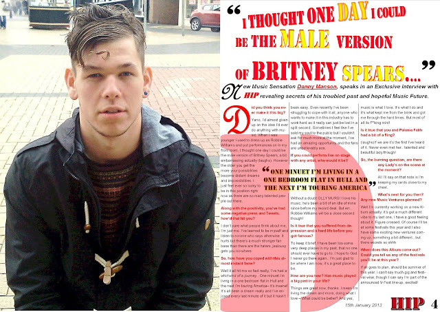
^^^^On this Draft I tried to change all the
negative points about my last Draft and started to concentrate more on style
and presentation of my Double Page Spread rather than structure. Some
negative points about my last draft which I altered on this one were the image,
the masthead, the style and prominence of the writing, injecting more
colour and the overall style of the magazine to make it look like a professional
music magazine rather than just a random document. I firstly decided to go
against the black and white idea as it was dull, unattractive and didn’t fit
with my previous other page drafts (Front Cover, Contents) well or house
styles. I thus experimented with how colour would make my double page
spread look which I overall felt made it look more bold, defined, professional,
attractive and eye-catching, drawing the audience’s attention more directly towards
it than in the last draft. I added the colour yellow into the design so that my
DPS fitted with the house styles of my other pages which also have yellow on. I
also feel using this colour gave my DPS design more depth, making it
more bold, interesting, attractive and eye-catching to an audiences eye. I
felt my masthead was boring, unattractive, small and dull in my last draft so
on this one I experimented with changing the design, using different size
fonts, positioning and colours for each word like some popular music mag
DPS's do from my research which I felt made it eye catching and stand
out more for being unique and different, fitting the style on my artist and my
magazines indie/modern pop genre. I also used overly emphasized, large
quotation marks as its conventional of music magazines, making it look edgy and
hipster making it relevant and attractive to my 15-25 stylish, hipster, qwerky
target audience. From my research I also found that a popular, interesting and
stylish convention in many magazines especially Q was to take the first letter
of the artists name and place in behind the text/body of the article. I
therefore felt I would experiment with this in order to make it look as
attractive and professional as possible giving of positive and realistic
connotations about the artist - connoting them being bold, attractive and
dominating the music industry. I therefore placed a large D for 'Danny Manson'
behind the body of the text in a red colour and stencil font to fit with
my magazines house styles and my artists style, then reduced the opacity
levels in Photoshop so that the article/ writing was still visible, as that’s
the main point of the page in the first place. I edited the ‘Hip' brand
name/logo in Photoshop by adding shadow and highlighting effects for continuity
and accuracy of the logo which is repeated on all the other pages in the same
style. I then edited the style and shadow effects on it also to make the word
stand out from the page, making it more, bold, dominant, noticeable and eye-catching
so that an audience are more likely to remember the name of the brand 'HIP' who
brought them this article/interview, imprinting the idea of buying it again
into the audiences brains. I placed the hip logo/ name in the bottom right hand
corner of the page as its conventional and means its at the audiences figures
tip when they turn the page meaning there more likely to remember the brand
name/logo and also more likely to buy the magazine again in the future as they
will remember it. I changed the pull quote in the middle of the article by
adding shadow and highlighting effects onto it as I felt this would make it
look more professional and conventional. By doing this it made this quote more
bold, noticeable and attractive, meaning an audience are
more likely to be drawn t it and be intreged to read the rest of the
article as they want to find out more. Doing this also meant that this pull
quote completed the style/design of this DPS and fitted with the rest
of my music magazines house styles for continuity making it look
professional and eye-catching to my audience. I also experimented with
highlighting specific words in the first stance to highlight the main focus's
and points of the overall article such as 'HIP' in red and 'Danny Manson'
red and underlined which is conventional of many similar genre music magazines
do like NME and Q. I felt by doing this I highlighted the focus and point of
the article by making them bold and dominant, drawing in an audience attention
(red being the most eye-catching colour to the human eye) making them
more likely to continue reading the whole article, as well as merging
the house styles (fonts, colours) making this draft feel more like and belongs
together and with the other pages than the previous draft did. Highlighting the
word 'HIP' also reinforces to the audience a reminder of the Brand that brought
them this magazine, making my brand 'HIP' more likely to be
popular with an audience and therefore more likely more people will
remember to buy it as they will remember who brought them the unique exclusive articles/interviews
within my magazine. I also defined the article and made it look as professional,
attractive, dominant and bold as possible by placing black lines between the columns
of the article. I felt this suited the style of the artist and the magazines
design complementing the house styles and colours making my magazine look
attractive, professional and as if it belongs together. I also chose a coloured
dominant image as I felt it complemented the design elements more than a black
and white one. I chose an image with a background I didn't have to
crop to make it look as professional, attractive, real and
conventional as possible. I chose an image with a seductive look, directly at
the camera for conventional direct address that captures an audience’s
attention drawing them into the page, making them feel the need to read the
whole article. I chose an image where I felt my model looked, stylish,
attractive and believably typical of an indie pop artist. Despite the
clear improvements there are also many things I could still experiment and
improve on as well as some conventional aspects being missing from this
particular d. To make it like a professional music magazine I need to add
conventional elements to the draft such as a page number, descriptions,
photographer and writer names, pages titles and what the Artist is wearing. I
also feel there are some design elements of this draft that I could
change, alter and improve upon, including the image, making the titles bigger,
experimenting with using more pictures and changing the format, making some of
the writing bolder and clearer and perhaps removing the big D from behind the
text or fading it more as it makes it hard to read the writing behind it.
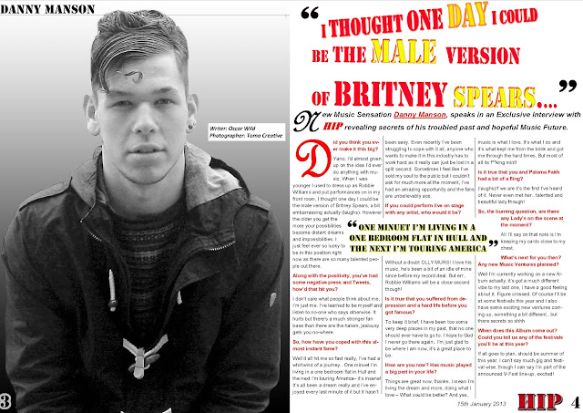
^^^^On the this draft I firstly ensured that
I added all the extra conventional features onto my draft
that weren't there on the previous draft such as page number on the
left bottom corner name of photographer, name of writer and 'Danny
Manson' titles to confirm the page. I also chose to experiment with the image
using Photoshop and photo manipulation to see how I could make it
look the most interesting, attractive and edgy to suit the artist’s
indie pop style and also to stand out as much as possible in order to
capture an audience’s attention. I experimented with making the image black and
white as I felt it gave the image an attractive edgy feel that suited the indie
pop style of my music magazine as well as the Artist. I felt that in
the previous draft the background was irrelevant and distracted
attention and focus from the main image therefore not catching an audience’s
attention as well as it could as it lost some of its dominance. I therefore
experimented with cropping the image out of its background using the auto
select tools on Photoshop and the fading eraser and straight lines
tools to make the image as natural and believable looking as possible
so that it doesn't look like it’s just been placed onto the page. I therefore
chose a faded black and white background which fitted with the images
black and white colour but was light enough to make it stand out from the
page against it. I added a white glow around the number 3 so that it stood out
from its black background and could be clearly seen to make it easy for an
audience to read and define it from its background. I added a black line under
the skyline title 'Danny Manson' to fit with the defined line theme on the
article/second page, complementing the design, making it look dominant and easy
to read as well as fitting with my magazines house styles
for continuity. I also experimented with removing the 'D' from the
background of my article as I felt in the previous Draft it was distracting, unnecessary
made the Article/writing hard to read and made the page look unattractive as
the page felt over crowded, as if it didn't fit together well or properly. I
felt this overall design makes the red and yellow colours stand out making it
dominant, attractive and easy for an audience to read. Despite this I still
think there are many negative points about this Draft that could be improved
upon such as the image and its background as I don’t think they fit together
well as the background has unnatural shadows and the image has unnatural
uneven edges. I also feel that the 2 pages of this DPS draft don’t fit
together as despite that black and white colour giving it an edgy,
indie, vintage feel it also goes against the house styles and other themes on
the second page and throughout the rest of my magazine. I feel this
makes the whole DPS look dull, not dominant and not stand out as
much against the red and yellow colours making it ineffective and
unattractive. I feel colours will work better on my image to fit with the house
styles, to attract an audience’s attention, drawing their eyes towards it and
making the image look more believable, interesting and attractive. I
also feel a lot of the sections of this design don't fit together
well which make the design look unprofessional with no connections so it looks
unattractive, doesn't draw an audience’s attention and has no
dominant/ key focus points which distract audiences attention.
Such as the box with the photographers and writers names in them, the
background against the image, the skyline and some of the fonts that don't fit
the house styles and look unattractive. On my next Draft I want to improve the
design so it has more continuity, dominance, suits the house styles and looks
attractive, perhaps changing the image all together. I want to experiment with
how dominant and attractive I can make it look, whilst fitting the conventions
and suiting the style of my artist and genre.

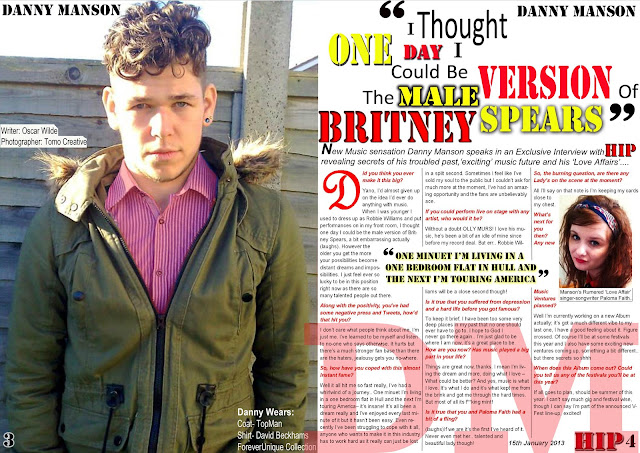
^^^^On this Draft I wanted to bring all the
positive points from my other DPS drafts together such as the conventional
layout, house styles, indie-pop appearance and fonts as well as
getting rid of and replacing some of negative unattractive points about my last
drafts such as the image, use of black and white, going against house styles
and the two pages looking disjointed from one another in order to create
the best draft possible. The first thing I did when creating this
draft was select a different image from my shoot which was taken on a location
that suited the artist and my music magazines style for it to look as
attractive, professional, relevant and as realistic as possible
unlike in my last draft which I felt was ineffective therefore I
replaced the image in this draft. From my previous drafts and research I found
that the conventional use of direct address proved effective in making an image
eye-catching, attractive and dominant, drawing audience’s eyes towards the page
so they subconsciously felt the need to read the entire article. I
therefore chose an image which was looking straight at the camera/ audience in
order to keep the effective, attractive and conventional use
of direct address on my music magazine Double Page Spread. I
chose this pacific picture also as I felt the model's appearance (hair,
clothes) look slightly rough and of the edge yet stylish, which I feel is
a typical and believable look for an Indie-Pop Artist in the
21st Century as well as his age and style fitting and attracting my 15-25
hipster target audience. I feel my model also appears rather
attractive and seductive in this image, which I feel grabs my audience’s
attention in making them want to read this article and the rest of the magazine
(as this is one of the first few pages in my music magazine.) I feel the
outside fence location is also typical of an Indie-Pop artist shoot, allowing
an audience to easily interpret what kind of Artist 'Danny Manson' is, which
makes my model seem like a believable artist and my magazine seem professional.
This also gives the audience positive connotations about 'Danny Manson' as it
makes him seem outgoing, off the edge, cool, rebellious and a true
life liver, which would attract an audience into wanting read the article
therefore retaining and building the Artist and brands popularity, like in
similar and current music magazines like 'NME', 'Billboard' and 'Q' do. The
image also gives no information away about what's to come in the
Article leading an audience to want to read on as there human nature leaves
them to be intrigued as to what's happened with Artist and what the
article is about. I kept the style of the layout with the image on one
side(left) and the article on the next(right) as well as all the other
conventional elements like the page number in the bottom corners, name of
writer and photographer, pull quotes, drop caps, stand first, issue date, brand
name, article in columns and extra-large quotation marks as they were on
previous drafts as many of them are needed to make the DPS make sense, work
as a professional music magazine DPS, make things easy and clear for
an audience to understand, read and define and to make the layout clear,
effective and understandable. I also feel that many of these chosen elements
make my music magazine DPS look attractive, stand out, eye-catching, relative
to my artist and the genre, conventional, effective and draw my audience’s eyes
and attention towards the page making them want to read the whole article. I
changed the font on the photographer and writers names so that they
complemented and blended in with the house styles of my music magazine for
continuity, accuracy, effectiveness and so that my magazine/DPS feels
as one attractive design that fits together rather than
it appearing unattractive, disjointed, ineffective and as if they had
just been placed there like on my previous DPS drafts. I felt this was
important to make my DPS attractive and eye-catching to make a audience want to
read it and buy my magazine again. I also changed my font, making it
larger and clearer therefore easier for an audience to understand and read. I
placed a white box neatly around the writing so that it was clearer to read,
suited the house styles, colours and box themes and complemented my DPS
layout/design. I made the box/writing blend around my image to make
it appear like a part of the DPS, as if it’s meant to be
there rather than it just looking disjointed and unattractive as it did
before on other DPS drafts. I experimented with using the various eraser tools
in Photoshop to make the edges of the box less neat, more rough and
fitting to the design of the image so that it felt connected
not disjointed and complemented the layout/design as well as
maintaining and complementing the Artist's rough, of the edge, indie pop appearance
which I feel builds the design and its aesthetic elements to make my DPS
look believable, professional and effective. However I kept the credit writing
(photographer, writer) in a smaller font so that it didn't distract an
audience’s attention or focus away from the main points of my music
magazine (images/article). I decided to add a 'DM' for 'Danny Manson' behind my
text on an angle as I felt it complemented my design, layout/Magazine/DPS
styles and house colours/styles. On a previous draft I placed a 'D' (for Danny,
the artist in the article) behind my writing, taken from the similar design
element 'Q' music magazine use on many of these articles which I felt made
there articles look dominant, attractive, bold, stand out and qwerky,
reinforcing to an audience the artist behind the article. However when I used
in on previous drafts it looked good, interesting bold and dominant but
felt slightly disjointed from my previous design, making the article writing
hard to read and understand. However on this draft I felt I would experiment
with taking this design concept and making it work in a positive way on this
particular draft as I personally like the idea as I feel
it positively connotes the artist as dominant, captures an audience’s
attention and clearly reinforced to an audience who this
particular article is about. To get over the problem of this design
element making my article hard to read, I reduced the opacity of the letters so
that the article was still easily clear enough to read easily on top of it. I
chose to use both letters 'D' and 'M' as they are both my artists initials and
as he is known by both names, I feel the using both initials
clearly enforces who the artist is automatically, as when an audience
see this page they would automatically associate it with him, putting my
article/magazines message across to my audience as clearly as
possible. I also feel that by using both initials and placing it on an angle it
makes my music magazine/ DPS stand out from the crowd (other similar genre
music magazines) for being different, meaning an audience
more likely to remember this music magazine and buy it again, and
increasing popularity. I decided to make the 'DM' in the background a stencil
font, large size and red colour so that it was clear, dominant, obvious, stood
out (red is the most dominant/eye-catching colour to the human eye) as well as
fitting with the house styles (colours/fonts) for continuity, making it
look professional and as if it belongs with the design rather than
disjointed like it did look previously. I feel that the way this design element
was placed complemented the house styles for continuity, suited the genre of
the brand/artist as it appears edgy, dominant and attractive and is
overall effective. I also removed the line under the skyline as I felt it was
unnecessary, unattractive and distracted attention away from the other main
points of the article/ DPS (image, pull quotes, interview.) As well as this I
spaced out my article more as there was a gap on my previous drafts at the end
and I felt by doing this it made the design look
more professional and perfect as well as allowing the font to become
larger/more spread out, making it as easy as possible for an audience to read
clearly and easily. Overall on this DPS draft I tried to make the design fit
together as best as possible and not feel disjointed as well as complementing
all my music magazines house styles for continuity making it look attractive,
eye-catching and professional. I tried to metaphorically polish the design
elements from previous drafts to make them as effective and eye-catching as
possible and got rid of those which I felt made my design ineffective,
unattractive and unprofessional. I feel that there are still several
points that could be changed, altered and experimented with such as perfecting
the image in Photoshop, seeing what the layout would look like presented
in a different way, perfecting some of the writing/font elements and
experimenting with the design and colours on my Masthead in order to
make my DPS as interesting, attractive, eye-catching
and professional as possible. On my next Draft I want to experiment
with changing my layout around, altering things and perfecting elements of my
DPS in order to achieve the best final DPS possible and to see what I can do
with my DPS and what works best overall.

^^^^ On this Draft I mainly wanted to
experiment with changing the layout of my design elements to see how it looked
and what I could do with it in order to make the best DPS I possibly could. I
firstly kept all the writing elements/ designs as they were previously like the
masthead, stand first, pull quotes and interview as I felt they were
predominantly effective, attractive and worked well as previously stated in my
other drafts but then I just moved them around to near opposite positions they
were in before to see what effect this would have to my
overall design. From my research I found that many effective DPS's went against
the conventions which made them stand out for being different and often look
more appealing, attractive and eye-catching to their target
audience. Therefore I wanted to see what effect
this would have on my DPS. I feel that this layout does
look interesting and makes it stand out for being different but I
also feel that it looks unprofessional and unattractive as it has no
dominant focal points and the dominance of the colours are lost within this
white-ness of the background and gaps in the design. To make this design work I
had to stretch some elements like the masthead and bundle the first stance into
3 lines to fill space and to make it look dominant and professional
however by doing this it actually made the design look
unattractive, disjointed, not well thought out, not eye-catching and all
round unprofessional (as a music magazine). I therefore think that for
this layout to work, I would need to tweak, change and alter some of the design
elements like the masthead and the stand first so that they fitted and
complemented the design. Therefore the previous layout worked better for
this/my particular DPS design elements, concepts and ideas. Another problem
was working the 3 joined images, that I had chosen to experiment with on this
particular draft, as when I put them all together it was hard to make them work
without them being out of proportion or stretched which ended up leaving gaps in
my overall design which therefore made the whole DPS look
unattractive, unprofessional and not an article which would attract
an audience’s eye or that they would want to read. To make this design work I
would have to use fewer images so I didn't have the problem of them
stretching and them being out of proportion which would allow for
the dominance of large images. I would need to inject more colour and
blocking so that it complemented my house styles, stood out from the crowd and
was dominant as well as editing my writing/font elements so that they fitted
with the design and didn't feel disjointed, stretched and out of
place. Overall it would need more planning as this
layout doesn't work well with my DPS's chosen design elements. On
this draft I also chose to experiment with using more images to see what the
overall effect would be. I chose 3 images which I felt looked effective,
attractive and dominant when they were alone, got rid of their backgrounds
(using Photoshop's various eraser and auto select tools),
placed them together in an overlapping order in Photoshop and placed
them on this draft design to see what they looked like. One of the problems
with this was when I placed them onto the DPS it was hard to make them
fit accurately without them looking out of place, disjointed from the
design/DPS and without them becoming stretched or out of proportion. To make
this design of a DPS work it would take a lot more planning. I would
most likely have to space the images out or make them larger or use
less images so the images actually worked precisely within the
layout without being stretched, unattractive or out of place. Each image
has also been edited in a different way to make them look as attractive,
effective and perfected as possible. The problem with this is when put together
in a group they look unattractive and disjointed as they look like
they aren't meant to be together. This also goes against the
house styles making this page have no proper focus points, not fit with the
rest of my music magazine, look unattractive, isn't eye-catching
and doesn't capture an audience’s attention. The idea of using more
than one image together was taken from other qwerky DPS's from magazines of a
similar genre like Billboard, Q and NME. I feel that on the one hand using this
concept has made my DPS more interesting and stand out for being
different. However on the other hand the images feel too close together which
makes the Artist look like a cloned boy band rather than just one artist, there
all edited differently with different colours making them look unattractive,
disjointed, like they don't belong and as if they have just been
placed there, their bodies have been chopped of at the bottom where the article
sits making the images look fake, like they have no bottom legs, stupid,
unattractive, takes away the illusion, unprofessional and is
unconventional of music magazines. To make this concept of using
more than one image on one DPS design work effectively,
attractively and eye-catching-ly I would have to space the images out so
they looked like images of one artist and not a cloned boy band(also so the
images don't stretch), make the images larger so there
more dominant with focus points, use full size images so
they don't look fake, stupid and like they have no legs, overlap the
article onto the images (like professional music magazines of a
similar genre like Q, Billboard and NME do) so the design feels like it belongs
together and effective rather than appearing disjointed and unattractive, the
Artist's poses would have to be completely different for
full effectiveness to show his different personalities/traits/styles
and each image would also have to be edited in a similar way than joins the
colours and house styles together so that they don't look disjointed,
unattractive and like they don't belong together. Overall I feel
that the ideas behind this draft are effective, make the draft stand out for
being different, appear eye catching and attract an audience’s
attention however there are lots of negative points about this draft
layout/design too as previously stated such as the images, font placement and
design layout and a lot of things would have to be changed to make this design
work. Overall I feel the previous Draft layout worked better for my chosen
design elements and article as the design appeared the most dominant,
effective, attractive, eye-catching, attention grabbing
and professional compared to this draft. On my next draft I want to
experiment with using the positive points about this draft and my previous
drafts, getting rid of some of the negatives and seeing what else I
can do with my design/layout in order to make it look the best music magazine
double page spread I possibly can.

^^^^On this particular DPS draft I wanted
to take the concepts and styles of my previous draft and experiment with how I
can improve them and alter them to see what they would look like in order to
make the best draft I possibly can. I decided to keep the article and
the rest of the bottom half of this draft in the same position/style as they
were in the last draft (didn't edit them) as I feel alone they
aesthetically look good, attractive, dominant, fitting of the house styles and
overall effective. However I decided to change the image position,
first stance position and masthead completely to see how I could
improve them. My last draft went completely against many of the
conventions of a music magazine which proved to make it a rather ineffective
and unattractive DPS so therefore I decided to place the images on the left
hand side and masthead and first stance on the right hand side as this is
conventional of a music magazine. I felt that by doing this it made my double
page spread look more conventionally like a music magazine and therefore appears professional and
believable as a real music magazine DPS as well as appearing slightly more
attractive than my previous draft. I decided to experiment with changing my
masthead to see what appearance it would give to my DPS. Many DPS
mastheads in similar genre music magazines like Q, Billboard and NME use the
Artists name as the title of their article which I feel is effective on other
music magazines to emphasise who the Artist is and what the article is about
making it clear to an audience as well as connoting the artist
appear dominant thus I chose to experiment with doing the same thing. On
my previous draft the artist behind the article didn't appear as
dominant, obvious or clear because the images were small and his name was in a
small font, therefore I chose to display his name/masthead in a large font
which I feel connotes the artist as dominant, makes it clear who the
article is about, its conventional professional and complements the
boldness of the house styles. I decided to display the masthead text 'Danny
Manson' is a stencil font and black colour with a red shadow behind its
background (edited with the blending options in Photoshop). I did this as the
font and colours fitted and complemented the house styles making the masthead
feel connected as part of the music magazine/DPS rather than as if it had just
been placed there like on many other drafts.(conventional). Red is also the
most eye catching colour to the human eye and black is the most powerful colour
which I feel makes the masthead stand of the page(shadow effect), eye-catching,
attractive, effective, dominant and grabs the audience’s attention when
they look at the page. I also think the chosen fonts and colours on the
masthead/artist name complement this artist’s indie-pop genre and
style, positively connoting him as powerful, dominant, stylish and of
the edge, helping to increase the artist and music magazines brand Hip's
popularity. I spread the stand first out do it fitted neatly into two lines
rather than randomly into 3 like on the previous draft. I feel this made it
look more professional, conventional and attractive to the audience's
eyes. Overall I feel these changes have improved the appearance of my
last draft but I still feel there are a lot of things that need to
change to make my DPS as professional, effective, eye-catching, attention
grabbing, dominant and attractive as possible. Some negative points about this
draft are the images (connected like a boy band, stretched, different
colours, not dominant enough, look like they have no
legs, unconventional), the blank gabs within the design, the lack
of dominant colour and proportion and the way the layout fits
together as it looks disjointed. (Many negative points
still relevant/current and carried over from my last draft). Overall I
feel that the original layout on my first few drafts(four) worked better than
this one as its more in proportion, dominant, suits the images, conventional,
attractive, suits the house styles, professional, blends
together precisely and is the most aesthetically pleasing. On the
next Draft I want to experiment with what else I can do with my images, article
and overall DPS design/layout in order to create the best DPS I possibly can. I
want to use my research and concepts from other music magazines of a similar
genre like Q, billboard and NME to create a new, interesting design
for my DPS, removing and replacing some of the negative points from this draft
and bringing together some of the positive points from all the drafts I have
done so far.

^^^^On this draft I predominantly wanted to
experiment with what else I could do with my music magazine double page spread,
my images and house styles to see how effective an unconventional DPS could be
in order to make my music magazine/DPS stand out from the crowd as well as to
enable myself to make the best music magazine draft I possibly can. I
also wanted to take the positive ideas and concepts from my last draft like the
placing of the interview/article at the bottom, house styles and dominance of
the masthead and also experiment with improving the negative points about my
last draft such as the placing, stretching, lack of
dominance, unprofessional and unattractiveness of
my images, the blank space, none proportional layout and the overall feel
of each element of my last draft being disconnected and disjointed from
one another. One of the first things I did on this draft to experiment
with the elements of a DPS and to improve upon my last draft was to move the
images and place them differently in order to make
them appear more interesting, professional and attractive
compared to in my last draft. On my last draft the images overlapped in a way
that made the Artist look like a cloned boy band and therefore I spaced the
images out in order to make it seem like images of just one Artist, non a band
(realism, clear audience understanding) which I felt made the image
placing/design more effective, understandable, attractive, interesting and
dominant. I decided to use images edited in similar ways and with similar
colour tones so that they complemented each other, fitted the house styles and
blended and looked like they belonged together, unlike in my last draft, I felt
this change made the images look more dominant, professional, believable,
attractive and effective. I also tried to use a range of different images in
order to improve from my last draft, as I felt this showed the different
sides/personalities to my music Artist more, making the page more interesting,
attractive and dominant, showing my music brand 'Hip's' dedication to their
Artists. I chose to put two images on each side of the page as in my last draft
I used three on one side on the page which meant the images were stretched and squeezed
out of proportion making them appear unattractive, not professional as well as
loosing there dominants. I felt by placing two images on each side of the page
which overall takes up around 50% of the double page spread restored the
dominance of the Artist onto the page (conventional), making the DPS personal
to the Artist giving off positive connotations of them (Danny Manson) being
attractive, powerful, dominant, cool, edgy, a laugh and easy going as well as
making my DPS appear attractive, eye-catching, bold, effective and stand out
for being different. I also tried to use and choose attractive and
seductive images which would draw an audience’s attention towards the page and
make them want to read my whole Article. To create this image effect, I used
the blending options, spot/perfecting healer, clone and colour effects
tools on Photoshop to correct and perfect the photos to make them seem as
perfected, attractive, effective, bold and dominant as possible as well as
making each image edited in a similar way so this draft DPS feels connected and
relevant rather than disjointed and dull like on my last draft. I then got
rid of the original dull backgrounds of each of the photos using the
Harsh eraser and auto select tools in Photoshop and the soft eraser to
fade and smooth the edges of the images to make them seem more believable,
realistic and blended into the background. I then turned the images to a
straight upright position and placed the images in an attractive, lined up
position, the way that I wanted them and in the placements that I felt looked
the most attractive, dominant and effective. I tried to plan the spacing and
layout out of this draft as much as I could in order for all the elements of my
double page spread not to be stretched, out of proportion or with big gaps
like on my previous draft. Planning the spacing and position of this layout/DPS
draft helped to make my draft appear more professional, in proportion, with fewer
gaps, less stretching of the images and have an overall more connected and
attractive feel. Despite this I still had a problem with this design and the
placing of the images for a few reasons. Firstly I feel that this placing of
images doesn't appear as dominant, bold and attractive as the DPS I have
created with other Drafts as the images are smaller and the page is more busy
and therefore doesn't drag the audience’s attention towards the page as much as
my DPS drafts with one image do as it doesn't have any key focus
points or clear structure. When placing the images onto the layout they still
ended up being stretched out of proportion slightly when trying to
place them which means this draft looks quite unattractive, unprofessional,
dull and not as bold. This creation and placing of the images took a long while
to create however doing this meant that it was hard to get rid of their backgrounds
on Photoshop entirely without leaving traces behind. On this
particular draft some of the original backgrounds of the images have not been
fully removed, erasered or deleted which means it has left random traces on my
masthead which suddenly makes my DPS look unprofessional, unattractive, dull
and not as dominant. Another negative point about this draft is the
problem of the images being cut of at the bottom or side which makes this DPS
look unprofessional and unbelievable as each image looks like they have no
legs, removing the attractiveness of this design concept. I
overall feel that the design elements of the images in this particular
draft are more effective and attractive than in other drafts with more
than one image as they are more spaced out, in proportion, larger, dominant,
attractive, connected (colour) and relevant. However for this design
element of the images to work certain things would have to be changed,
altered and improved such as removing the whole of the images backgrounds,
using full size images and making sure the images are in proportion not
stretched in order to make this overall DPS design look as professional,
attractive, realistic, believable, dominant, bold and effective as
possible. However I do feel that the use of one large image on my DPS
designs/drafts has proved more effective than using more than one image as they
appear more attractive, bold, dominant, eye-catching, have clear focus points,
less busy, easy to understand and take information in, interesting,
conventional and effective. Another point I tried to improve upon on this
draft, from a negative point on my last draft, was to try and make this
double page spread draft appear more connected and like each element
belongs together rather than it looking disjointed and dull in order to
make it my DPS appear as professorial, attractive and effective
as possible. I also felt that the placing and design of the Masthead was
boring, dull, and unattractive and went against the house styles due to its font.
I therefore decided to use a font stencil as it fitted with the house
styles, complemented the Artists Indie-Pop style and linked the Artist
clearly with my music magazines brand 'Hip' as I used the same font that is
used on their Brand name/logo. I then placed the Masthead behind the heads of
the images in order to make the design feel more modern, attractive,
conventional, stand out, fit the Artists indie-pop style and connect the design
together more in order to make this DPS draft feel connected and as if it
belongs together rather than feel disconnected, dull and out of place like on
my other draft. I chose to use a bold black font as it contrasted well with the
images and backgrounds of these pages in order to make it noticeable,
stand out from the page and complemented the house styles, colours of my
DPS/music magazine and connoted the Artist positively as bold and
dominant. Overall I think that this experimental design had many positive
elements about it such as the unique layout which makes it stand out from the
crowd, the images make the article personal to the Artist showing his different
personalities/sides, the layout seems more connected than in other drafts
rather than disjointed and the house styles work well together for continuity
and to make this DPS feel like it belongs together. Some Negative points about
this draft are that there’s no clear focus points, there’s still many white
gaps that are blank, its unconventional and the images are slightly out of
proportion/stretched. Therefore this draft is effective, different and bold but
could be improved to make it appear more attractive, professional and dominant.
On my next draft I want to experiment with improving and developing one of my
better/experimental existing drafts and adding extra design elements in order
to improve my Draft as much as possible in order to make the most effective,
dominant, bold, attractive, eye-catching, attention grabbing, strand out and interesting
final draft I possibly can.

^^^^I decided out of the last three experimental
drafts this one was the most professional,
dominant, interesting, attractive and aesthetically pleasing. I
therefore decided to experiment with it to see if I could add any extra details
of improvement to see what it would look like and if I could make it any
better. Within articles I made reference to a rumour of Danny Manson (the
artist in the article) having 'a fling'. Many music magazines(and other form of
media-newspapers, TV, gossip magazines) of a similar genre like NME, billboard
and Q, over-emphasis certain aspects of their articles by using puns, kickers,
images and teasers which suggest shocking, new or interesting information which
grabs an audience’s attention into reading there article/music magazine. As
this is meant to be an exclusive interview I felt this particular information
about 'Danny Manson' having rumoured relations with another music Artist Paloma
Faith would be of particular interest to my music mad, reality show obsessed,
hipster 15-25 aged target audience. Therefore I decided to emphasise this
particular information in a way that i felt would grab the my audience’s
attention towards the page, making them want to read the article and therefore
making my music magazine as successful as possible, also increasing the
popularity of my music magazine as my audience feel they’re getting exclusive,
one of information and will therefore want to buy it again. I therefore felt
the best way to grab an audience’s attention and associate both artists
together was to use an image as it gives the illusion of realism and an
audience will automatically associate the two Artists together as their faces
are placed within the same DPS article. I then decided than I need to back this
image up with some written information that audience’s secondary understanding
yet leaves out key details and questionable facts which would act as a teaser
to an audience, making them want to read on into the article to find out more.
I therefore chose to write a simple catchy phrase in the form of a pun that
withheld information, relevant to the Artist and connected both images on the
page which is 'Manson's rumoured 'Love Affair' with singer-songwriter Paloma
Faith....' I decided to place both Artists names within the phrase so an
audience automatically connect both Artists together, suggesting there
having some kind of relationship. I then decided to use a pun which was a play
on the lyrics/title of one of Paloma Faiths recent songs, the quote 'Love
Affair', which I felt made the information relevant to the Artist, catchy and memberable
and left the audience with suggested information that makes them feel the need
to read the whole article in order to find more about what 'Love
Affair' actually means. I chose to place an ellipsis '...' and the
end of this description/written information as it suggests that this
information continues and will be described in more detail within the article
itself, which subconsciously persuades audience/makes them feel the need to
read on. I felt using the word rumoured acts as a rhetorical question which
with holds information that can only be answered if the audience read the whole
article. Overall I feel this piece of information is relevant to the image and
connects both artists. I feel that adding the addition of the image and the
description complements and improves this draft, adding conventional elements with
rhetorical questions, puns and teasers building the interest and believability
of this article, persuading an audience to want to read the article to find out
more. This is typical and conventional of other similar genre music magazines
like NME, Billboard and Q and makes my draft appear more professional,
attractive and eye-catching, drawing in an audience’s attention, making my
music magazine/DPS overall more memberable which means an audience are more likely
to buy my music magazine as they enjoy it and feel like there gaining exclusive
information, building its popularity. I chose to place the information in a
white box under the image and to place the whole thing within the article (at
the bottom) as this is professional and typical of music magazines, makes it
look professional, fits with the house styles and blocking themes and
complements the layout by balancing the space and content. I edited the
apparent 'Paloma Faith' image in Photoshop in order to make it appear as attractive,
clear, perfected, and dominant, fitting with the house styles/colours and professional
as possible in order to draw an audience’s attention towards the page and to
read the article itself. The description under the image is also in an Arial
Font and size 11 writing as it conventional of music magazines, looks
attractive, fits with and complements the house styles and also makes it clear
and easy to read. I also edited the Masthead and changed it to a stencil font
in order for it to complement the house styles/fonts, be relevant/ fitting to
by Artist/Brands Modern Indie-Pop genre and to overall complement the style of
my music magazine DPS which I felt made it as attractive, eye-catching,
effective, bold and dominant as possible. I feel this edition to the draft
improved the design and its concept a lot however I still feel
this particular draft is not the best as stated before on the
previous draft. This is because there are many negative points about this draft
such as the use of three contradicting images that are small, unattractive and
overlap, the layout not fitting together smoothly and feeling like its
disjointed and just been placed there rather the appearing effective and
attractive and the unconventional placing of writing makes the layout and
designs look unprofessional and unattractive compared to other drafts
like my forth one. I feel that to make the image and description work within my
DPS/article however to make them work to full effectiveness I will
need to change my lay out are replace the negative points with good points. On
my next draft, I want to take the best and most effective
and professional draft I have created previously and place this added
design element (image and description) onto my most effective draft in order to
improve it and complement it as much as possible. I then want
to continue to perfect and develop my most favourite, best and
effective DPS in order to create the most attractive, eye-catching, bold,
dominant and professional DPS for my music magazine that I possibly can.

^^^^On my next Draft I have chosen to
develop my most professional looking, attractive, dominant, bold, aesthetically
pleasing and effective DPS I have created so far in order to create the best
DPS and end result I possibly can. From my previous Draft I found that using an
image and description to highlight a part of the Article/interview, where both
famous music Artists Danny Manson and Paloma Faith had a rumoured fling, proved
an effective method in making my magazine more interesting, eye-catching,
effective and attractive, adding believability and interest to the article,
drawing an audience’s attention towards this DPS and also subconsciously
persuading them to read the whole article to find out more(the truth) as its
suggesting yet withholds information(conventional). I therefore decided to
place this design elements within this particular draft/layout which I felt
improved upon the original design, making it as professional, intriguing,
dominant, eye-catching, attention grabbing and attractive as possible. Despite
experimenting with changing my masthead I felt this masthead of a pull quote
was more interesting, bolder, effective, attractive and attention grabbing
than just the artists names as it suggests exclusive and intriguing information
about what the artist has actually said within the interview, persuading an
audience to want to read on to find out more and the meaning behind the quote.
Therefore I feel this current masthead is more attention grabbing
than just the Artists name, which doesn’t tease the audience or
suggest as much. I also feel these mastheads colours and styles are
more eye-catching, vibrant, dominant, interesting, attractive and stand out for
being different than my other masthead drawing the audience’s attention towards
the page, with the current masthead fitting and complementing the house styles
of my music magazine/DPS too. On my next Drafts I want to experiment with elements
of this design, the image and masthead in order to make them appear as
attractive, effective, professional, eye-catching and perfected as possible in
order to persuade an audience to want to read this article/magazine/DPS and buy
my magazine brand Hip again in the future as they liked it that much.

^^^^On this draft I wanted to continue to
develop my best DPS draft design/layout in order to make it as professional,
eye-catching, attractive and professional as I possibly can. One element I felt
I could experiment with and improve upon even more was my masthead. From my
research and previous drafts I found that a bold, unique, dominant and
colourful masthead was effective, eye-catching and attractive (especially for a
male Artist) as well as complementing my house styles, my Hip brands
style/genre/theme and the Artists Indie Pop genre, style and
colourful personality. I therefore wanted to continue to develop my
masthead so I emphasised and highlighted words of importance so that it draws
an audience’s attention towards the main points, helps there understanding of
the article and looks aesthetically pleasing, interesting, unique and
attractive therefore standing out for being different. I felt that highlighting
and emphasising words in colours meant that words in both yellow and red
spelt out a separate phrase 'one male Spears' and 'day version Britney'
which leaves the audiences with even more unanswered questions and teasers than
encourage them to read the whole article as the masthead makes them feel the
need to find out more, complemented by the way it’s a catchy and rememberable
layout and phrase. I used the colours red, yellow with black and white as there
conventional, there dominant primary colours, there vibrant, stand out from the
crowd and complement the colour scheme well. Red is also the most dominant and
bold colour to the human eye and therefore will draw an audience’s attention
directly towards this page. I used Photoshop to create every word separately
and used to shadow effects and alter/stretch tools to make each word slightly
different to the next which I felt created a unique masthead, that’s aesthetically
pleasing, attractive, bold, attention grabbing, eye-catching and stands out
from the crowd. I used shadow and highlighting effects on each word so that they
are clear, noticeable, dominant, stand out from the page and automatically grab
an audience’s attention when they see this page due to its unique, bold and
dominant appearance. The up and downs of the writing and the changes in colour,
font and size are almost a symbol of what’s to come in the article - the ups
and downs of the Artists life, the happy times (yellow) and sad times (red) and
complements the artists edgy, outgoing and unique personality which makes the
page relevant and personal to the Artist in the interview, 'Danny Manson'. I
used the Fonts Stencil and Cambria in order to suit the house styles for
continuity and the changes in font symbolising the Artists off the edge, unique,
ever changing, misperceived personality and life. I decide to keep the writing
cleanly upright as if on horizontal lines (unlike on the previous draft) as due
to the complex and uniqueness of this mastheads design, I believe by
doing this it makes the masthead easier to read, bolder and
clearer to understand as soon as an audience look at it (as British humans
naturally read horizontally from left to right). I used over-exaggerated speech
marks in black as it emphasises the fact this is a quote
direct from the actual real artist, it conventional, successfully
used by similar genre music magazine like MNE and Q and complements the house
styles and indie pop genre, style and design of my music magazine and Artists. The
fact it’s a unique looking masthead makes it more interesting, effective and
attractive which means it will easily be remembered. This suggests an audience
are more likely to remember this Article and the music magazine brand that
brought them it which will therefore make them more likely to tell friends,
colleges, family ect (increasing popularity) and are therefore also more likely
to buy the magazine again, just like their friends, families, colleges ect are
more likely to be persuaded to buy my music magazine Hip too.(often for
the first time). Overall I feel this is a very successful, professional,
effective and attractive double page spread for my music magazine. On
my next Draft I want to perfect the minor detail and add any extra design
elements or conventional aspects that will complement and improve my current draft
in order to create the best final double page spread draft I possibly can.

^^^^From previous Drafts I found that using
the background of 'DM' in red (stencil, large font)proved to be
an effective way to make the artist appear dominant/attractive/edgy, the
page appear attractive, effective, stand out, unique, complementing the
design and the magazines indie/modern pop genre. Therefore I decided to
experiment with adding this element back onto my current most effective, professional,
new and improved contents page draft design which I felt made it
appear even more attractive, bold, professional, effective and dominant,
which I feel adds to design in order to make as much positive development and
progression as possible in order to make that best final DPS draft I possibly
can. On my next draft I want to experiment with perfecting these design
elements as it's on an unattractive angle that distort and covers up the Paloma
Faith image (negative point). I also want to experiment with editing the main
photo/image of the Artist 'Danny Manson' so that it’s as perfected, attractive,
bold, attention grabbing and dominant as possible as well as to also try and
make the image complement the house styles/colours as much as possible in order
to link my brand Hip and the Artist altogether and to make my music
magazine DPS look as Aesthetically attractive, effective, relevant,
dominant and bold as possible.

^^^^On
this Draft I edited the main image of the Artist 'Danny Manson' using the
spot healing, healing, clone, eraser and perfecting tools in Photoshop to
perfect his skin as much as I could in order to make the image look as professional
as possible and the artist to look as attractive as possible in order to
persuade the audience to want to read the article as well as allowing the brand
to gain a reputation of promoting there Artists successfully and in a positive
light. I also edited the eyes of the Artist 'Danny Manson' in the main images
using the liquidify tools to open his eyes as much as possible so that the use
of direct address is emphasised as he appears as if he’s looking positively
directly at the audience (conventional) giving the DPS a personal touch and
drawing an audience’s attention directly towards the page as they feel like the
Artist is looking directly at them making them more likely to feel the need to
read it. I feel opening his eyes more also makes him took more
attractive and good looking (promoting him positively). I also edited his
eyes using bright blue small circle tools in Photoshop, which I reduced the
opacity of for realism, and placed on top of the colour of his eyes in order to
make his eyes seem brighter, bolder and more attractive(boosting and
complementing the Artists cool/attractive public image), improving the quality
of the image to make it seem more professional as well as improving the effect
of direct address as an audience as more likely to notice his
eyes and be draw towards the page by them. I also changed
the colour of the Artist in the main images shirt using the auto-select tools
in Photoshop to select his shirt, then choosing a red colour and reducing the
opacity till it was believable that the shirt was actually red. I did this in
order to connect the pages together and to make the image complement the house
styles/colours, which makes the whole DPS feel connected and linked together as
well as automatically associating the brand 'Hip' with the Artist, subconsciously
reminding an audience of the brand who brought them this article/interview. I
also edited the 'DM' which is placed behind the body of the text so that it was
on a more attractive angle the suited the house styles and looked
aesthetically pleasing and effective as well as to move it to an
angle that didn't ruin, distort or cover up the smaller image of 'Paloma
Faith', like it did on my previous draft. On my next Draft I plan to add any
minor conventional details and modify any aesthetic/design details which I feel
may be positively improved by editing and tweaking them in order to make
my final draft as professional, attractive and effective as I possibly can.

^^^^The main Aesthetic/design element I
wanted to improve upon on this Draft was the 'DM' which sits behind the body of
the main article/interview/text. On previous drafts I experimented with using
different Fonts and found that a normal 'Rockwell' font was the most effective
on this particular design element as it complemented my music
magazine/DPS's house styles and the rest of the layout designs the
best, I felt it suited the Artist 'Danny Manson’s' style, complemented the
brand/artists Indie-Pop Genre, looked aesthetically attractive, effective,
bold, stands out, dominant and is clear for an audience to read. On this
Draft I experimented with replacing the stencil font with the Rockwell font on
this particular design element which I feel proved the most effective font as
it complemented the design, Artist, house styles, brand and genre the best and
I feels it overall looks very effective, dominant and attractive. I
also chose to experiment with reducing the opacity of the large 'DM' behind the
article even more in order to make the article itself easier and
clearer for an audience to read. On this draft a main conventional point I
chose to add to this design is a list of what the Artist wears in
the main photo/image. Some magazines include this as a way of
promoting the Artist and to gain money from clothing companies/ designers/
shops who sponsor the brand to dress their Artists in items of clothing in
order to promote them. Music Magazine brands like NME, Billboard and
Q also often add a list of what there artists wear as there
audience/readers, who are fans of the major artists, will be interested
in where they got their clothes from so they can buy them there selves (for
themselves or boyfriend ect), which gives an audience/reader even
more reason to want to buy this music magazine. I felt that adding this
conventional element/design would be effective for my particular brand 'Hip’s
target audience as there predominantly stylish, hipster 15-25 year olds with
keen interests in fashion and shopping (and obviously modern music) and
therefore I feel will be particularly interested in my music magazine if they
can also find out where their favourite Artists get their clothes from so they
can look as good as them (relevant to my target audience). I made the clothing
list a small font as its conventional and isn't the main focus of my article
and a white colour as it fits with my house styles/colours and contracted well
with the colours of my image making it as easy to read, clear and noticeable as
possible. I also chose to make the photographer and Writers credits on the
main image (left hand side page) slightly smaller as its conventional and
I didn’t want it to distract attention from the main focus of the article - the
Artist 'Danny Manson'. I feel that overall this Draft is the best DPS I have
created so far and there isn't much left to do with it in order to perfect it
as much as possible. I feel that my next draft will be my last draft and the
only things left to do are predominantly small details that will help to
improve and perfect my design as much as possible in order to create the most professional,
attractive, effective, dominant, aesthetically pleasing, believable, stand out,
attention grabbing and eye-catching final draft.
^^^^On this Last Draft I just wanted to
perfect a few minor details in order to create the best final DPS draft I
possibly could. One of the main things I changed on this draft was the large
red 'DM' that sits behind the main article/interview/text. On my previous draft
I reduced the opacity of it in Photoshop however I felt this made
this design element less dominant and hard to notice and therefore
it didn't look as effective and attractive as it did in previous drafts. I
therefore felt reducing the opacity was unnecessary as the writing
was still easily readable (for my young 15-25 target audience) when the
opacity was increased slightly and I therefore chose to increase the
opacity of the design element slightly on this draft so that it looked
attractive, dominant, bold and clear. I then decided to change the position of
this design element so that it was placed horizontally at the bottom of
the page. I decided to do this as from my DPS research I found that
writing/design elements like this looked much more conventional, attractive,
dominant and effective when placed horizontally across the bottom of the page.
When I changed this design elements position I felt it instantly made my
design more attractive, bold, effective and dominant as well as making it feel
more connected and easy to read as it fitted the motion of my vertical writing
(as people read horizontally from left to right) and therefore by changing
the position the design element suited my DPS design more as well as
complementing my Artist and Brands styles, house styles and music genre.
When changing the 'DM' writing position it also helped to highlight and
emphasis the brand name Hip in the Corner of the page, linking both the Artist
and brand together which subconsciously reinforces to the audience the brand
who brought them this exclusive article, making them more likely to remember
and want to buy Hip music magazine again. The 'DM' also overlaps onto
the right hand side page slightly which gives it an edgy feel fitting
of the magazine/artists indie - pop genre and also links both pages together in
and effective way, clearly emphasising that both pages are meant to be
together as one. The one problem I had with placing this design element at
the bottom of the page was that it covered up and distorted the smaller image
of 'Paloma Faith', making it look dull, less noticeable and not as effective as
it was in previous drafts. I overcame this problem by moving the image upwards
into the right hand side column which meant it was just as effective, noticeable,
attractive and clear as it was in previous drafts. By moving this smaller image
of 'Paloma Faith' upwards, I also felt it made the all-round layout design
look more attractive and also made the image feel more connected with the article
and design as it was merged within it, making it appear more noticeable, clear,
relevant, attractive and effective. I also chose to make the issue
date '15th January 2013' a bold font so that it stood out from the article,
which instantly establishes it’s on its own and not part of the article itself.
I then spaced out and evened out the main article/interview text as much as I
could, placing the black lines equally between them, to make it look professional,
believable, conventional, effective and attractive as possible. I also made
sure each word was on the page and could easily seen and read by its
reader/audience as that’s the point of an article being there in the first
place as well as moving the article away from the bottom edge of the page as
its conventional of a music magazine, allowing the writing not to get muddled in-between
the issue number, brand name and page number, clearly defining each section of
the DPS. I finally made the Masthead as large as I could on the page (without
covering up any other words) as I wanted it to look as eye-catching, bold, dominant
and conventional as possible in order to capture an audience’s attention,
making it noticeable, attractive and effective. I feel that overall this Final
DPS has been perfected as much as it can be without ruining the design or
layout. I therefore believe my final draft is the best draft I have created and
I also believe it is an overall effective, dominant, eye-catching, attention
grabbing, attractive, effective, aesthetically pleasing, stand out, unique,
conventional, bold, complementary, professional, believable and successful
final Double Page Spread draft.
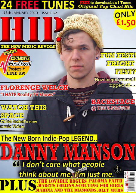 ^^^^My Final Music Magazine Front Cover.


